Visualizing the User Journey
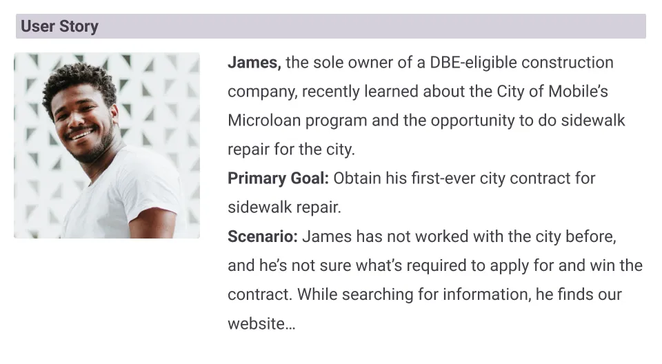
We started by creating a detailed user journey diagram to visualize the steps that could be required of a business owner seeking to work with the city.
The user journey diagram was key in Qwally's conversations with city officials, uncovering insights that informed user flows and information architecture, improving the experience for both businesses and the city.
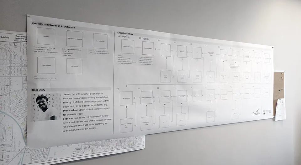
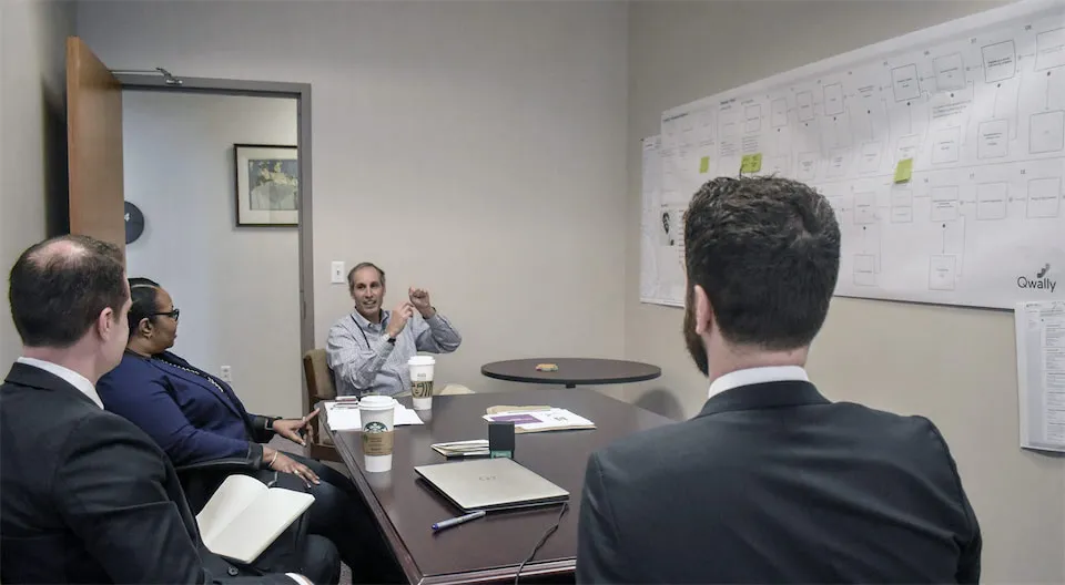
Qwally meeting with Mobile, AL City Officials
User Flows
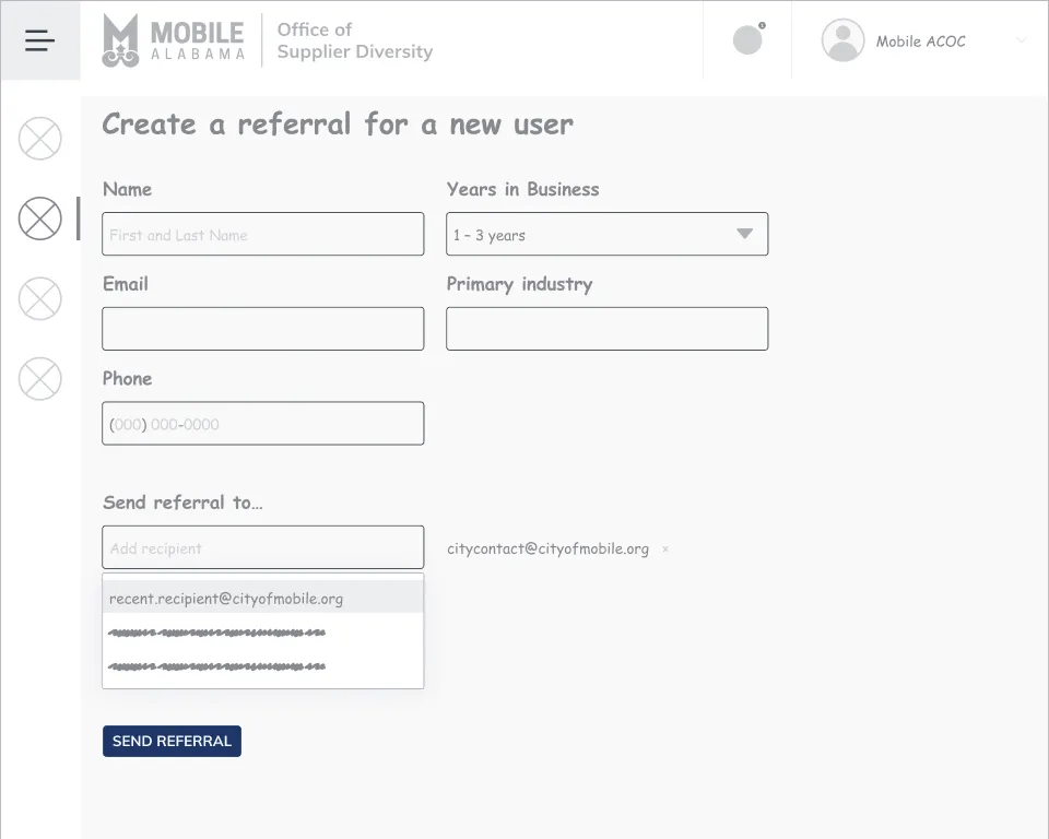
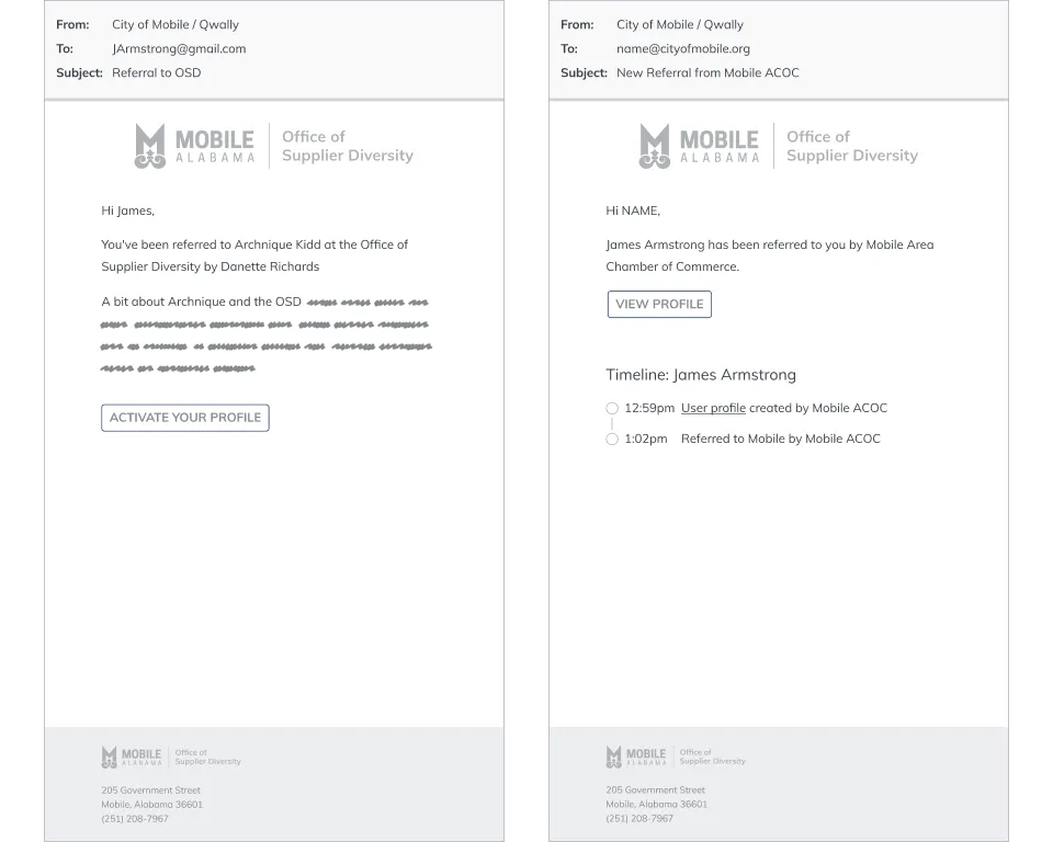
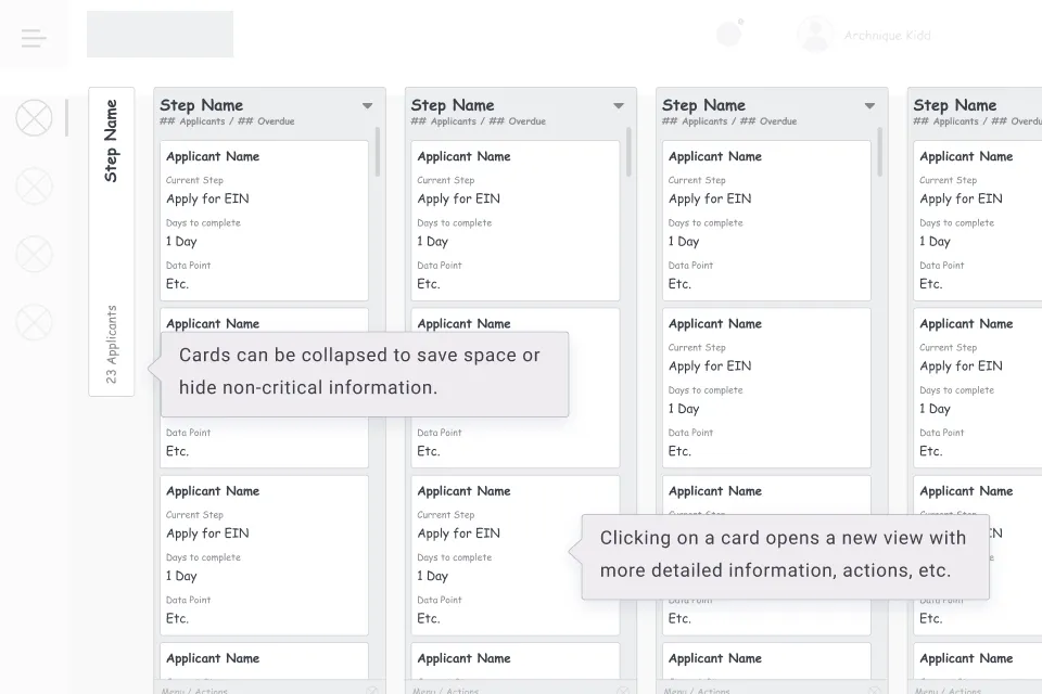
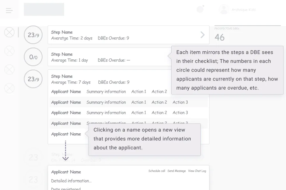
For Qwally's presentations to city officials in Mobile, I created sample user flows and wireframes that demonstrated how Qwally's software could improve the flow of communication between key stakeholders across the city.
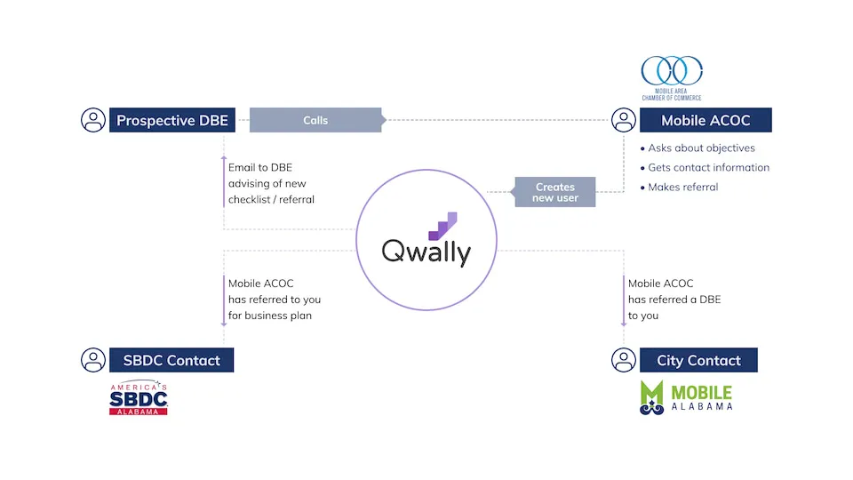
Wireframes: Dashboard and Frontend Concepts
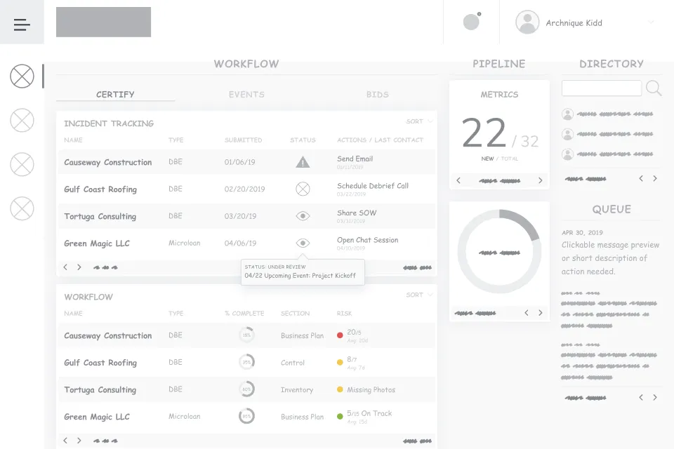
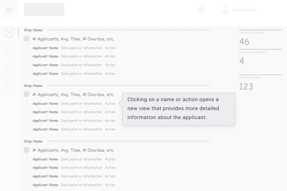
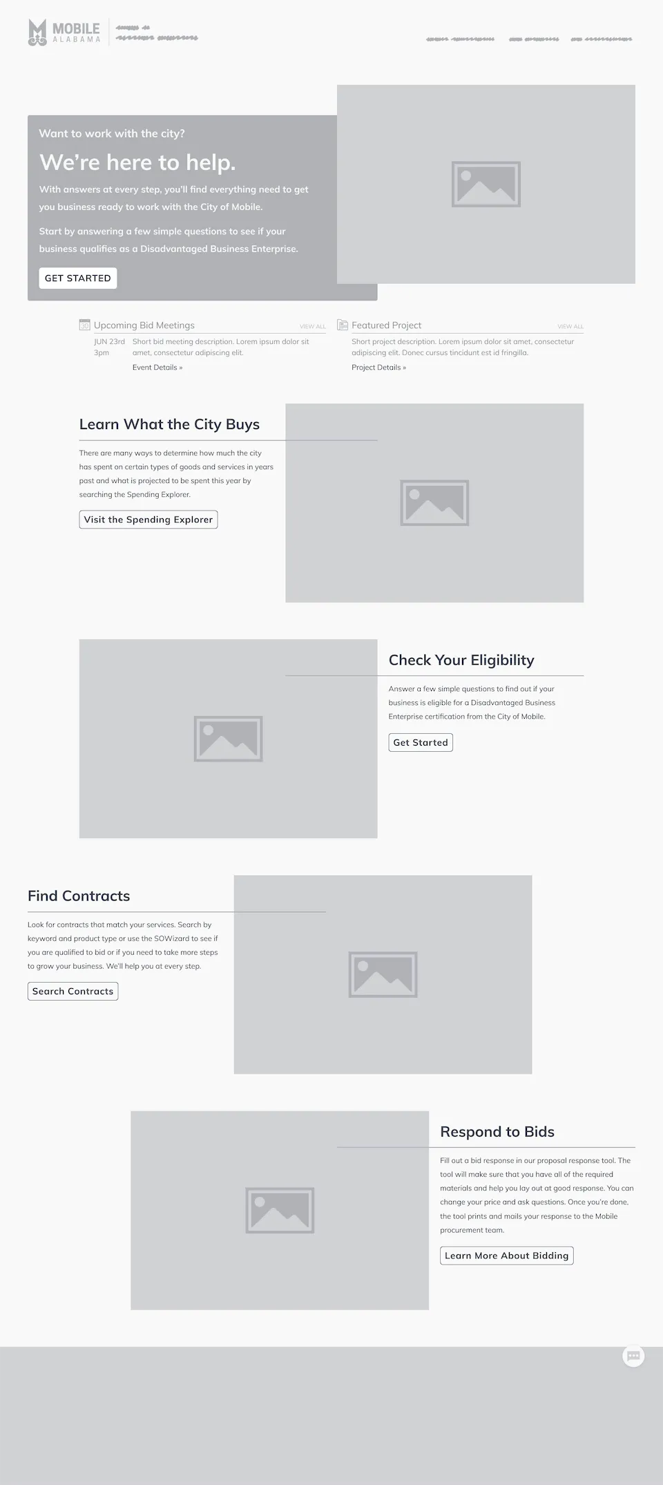
Informed by the user journeys and insights from Qwally's meetings with city officials, I created a range of wireframes to define the user experience. These included concepts for a dashboard used by city officials, details of key user flows, and public-facing pages.
Wireframe: Public-Facing Page
UX: Quick Start Plan
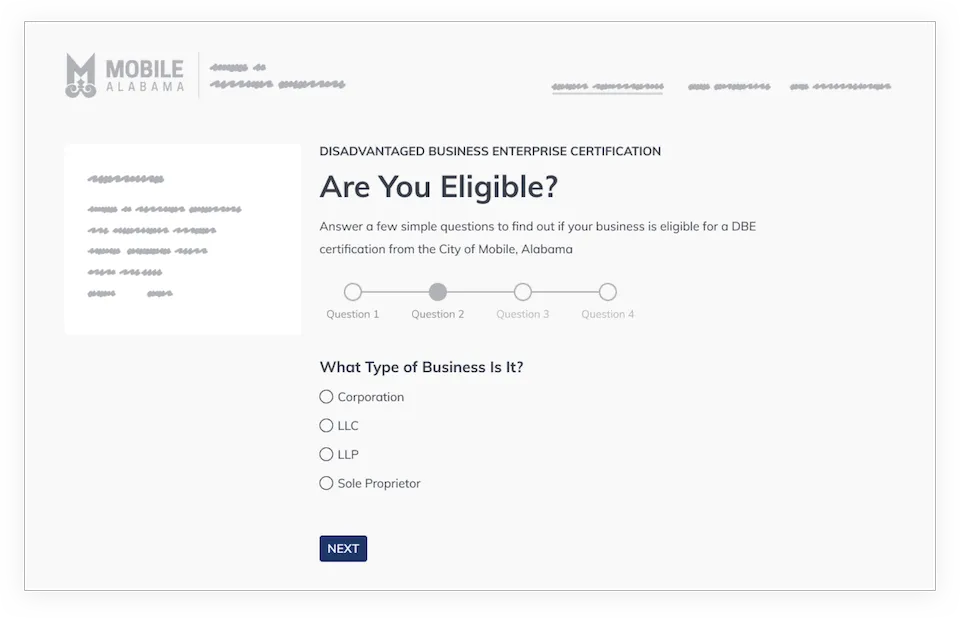
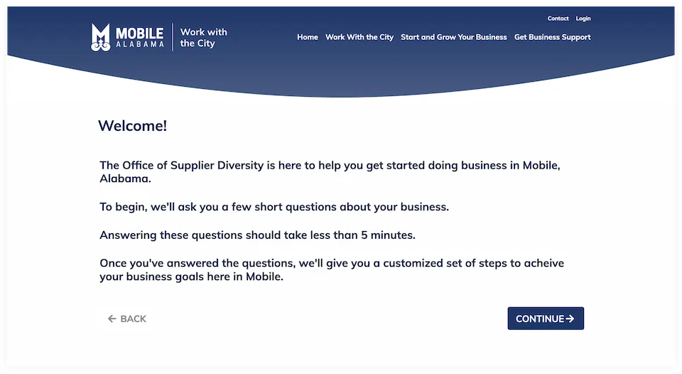
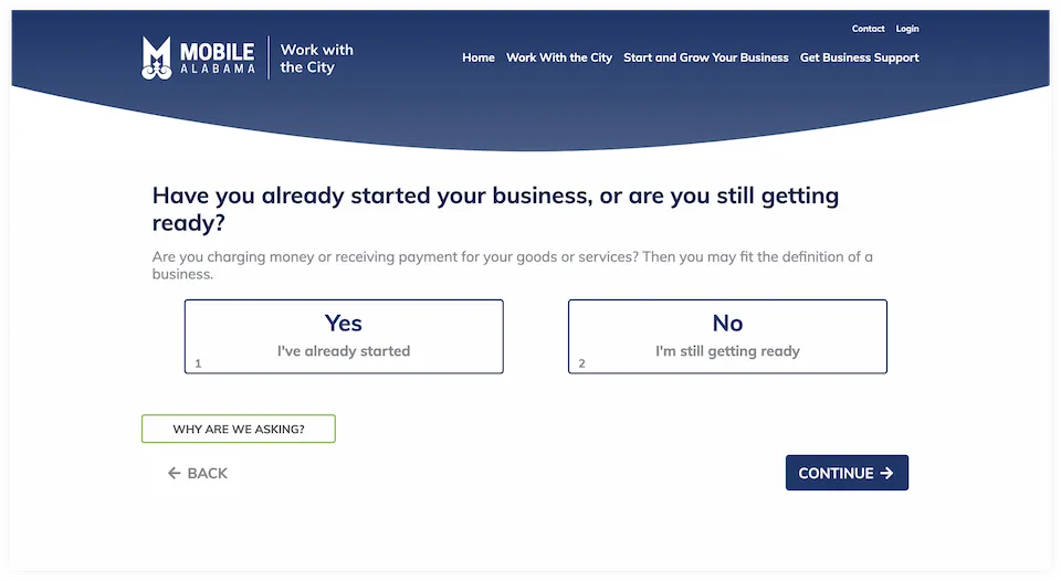
Based on the user flow mapping, feedback from city officials, and Qwally's user testing, we created a quiz-like experience for business owners that quickly leads them through a series of relevant questions.
After completing the quiz, users receive a personalized checklist they can use to ensure they have everything they need to be eligible to work with the city.
The final UX and design present a series of simple questions that business owners can complete in minutes, a huge improvement over the previous process, which required lengthy in-person meetings.
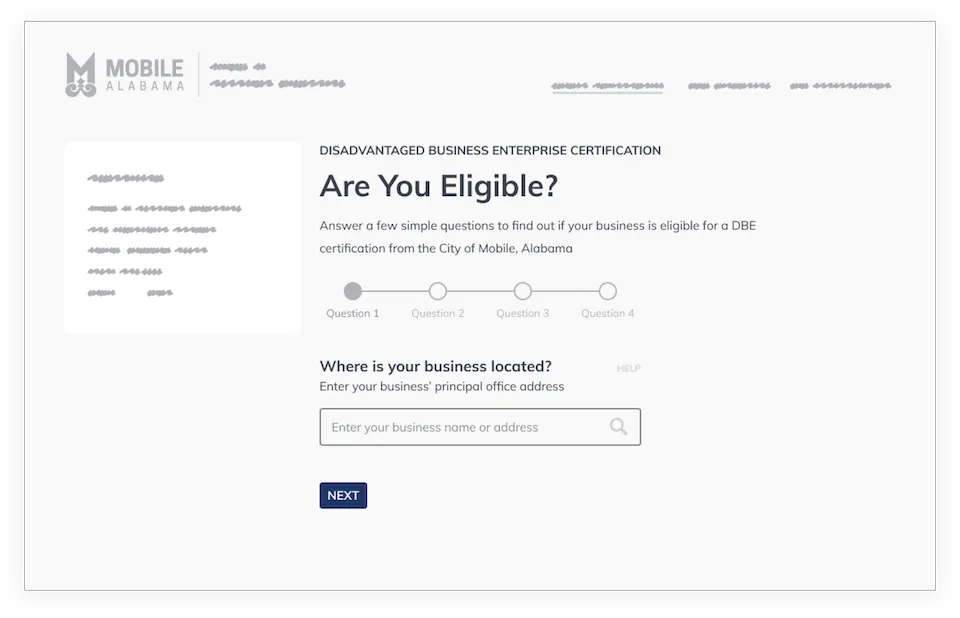
Work with Mobile Portal
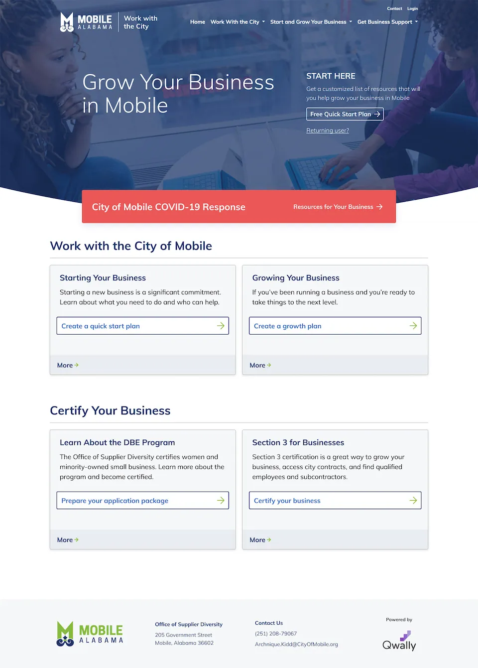
When Qwally was ready to launch their solution for the City of Mobile, I designed a portal that features the Quick Start Questionnaire and a range of SEO-optimized educational resources.
Today, I continue to work with Qwally to iterate and improve on their platform as they bring their innovative tools to a growing list of cities.
Testimonial
“We were looking to turn some loose ideas and research into a software platform for city governments. What made Kyle the easy choice for us was his focus on fundamentally understanding the problem to be solved and shepherding our team (and our clients) through that process to arrive at a solution that truly helped users accomplish their goals.
As we’ve grown and encountered new challenges and opportunities, we’ve been grateful to consider Kyle as a trusted advisor and direct extension of our team.”
Chris Offensend
Qwally Co-Founder & CEO