UX and UI
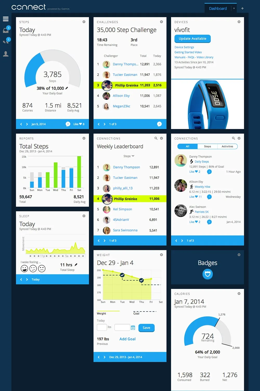
A key challenge of this project was figuring out how to support a wide range of devices and activities without overwhelming customers. After much research, many prototypes, and countless meetings, we launched with a card-based approach that addressed several important use cases:
- New customers could be onboarded quickly and easily find activities, set goals, and manage devices.
- Power-users had easy access to advanced data and activity analysis
- Connect could easily support future devices, features, and data
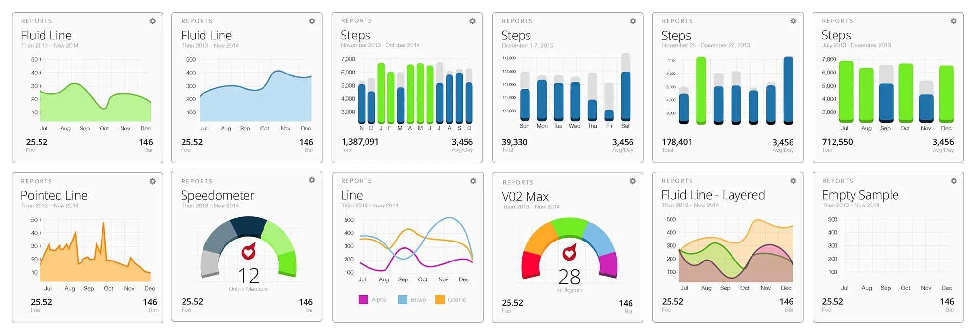
Dashboard
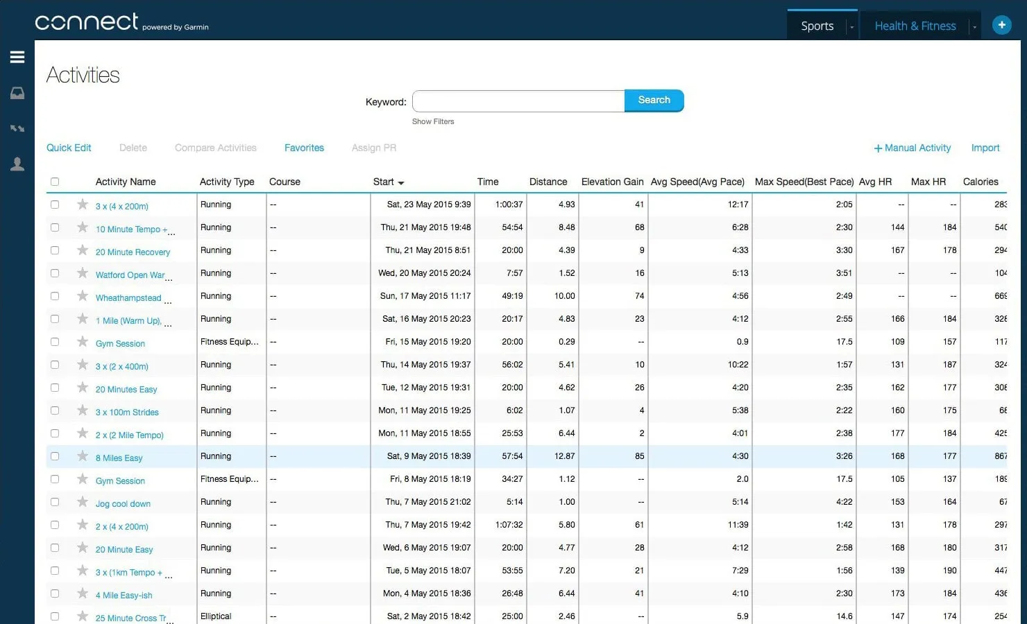
Activities
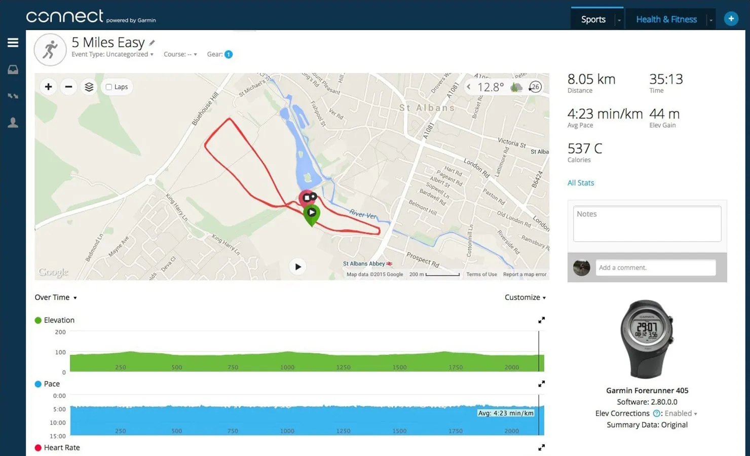
Activity Detail
UI Style Guide
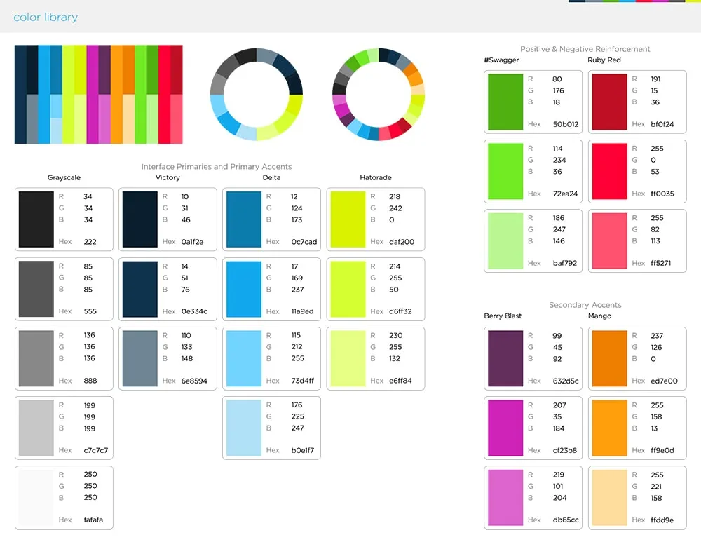
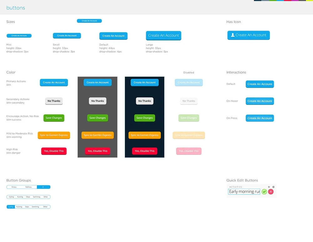
Multiple design teams contributed to different aspects of the platform and marketing. To ensure consistent application of our design patterns, we developed a comprehensive style guide. It included elements like color, typography, interface elements, and more.
Color
Buttons
Widgets
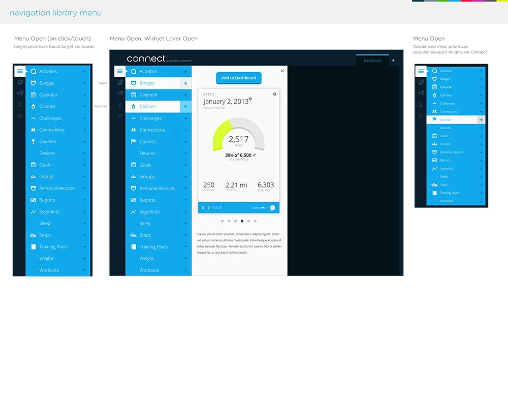
Navigation
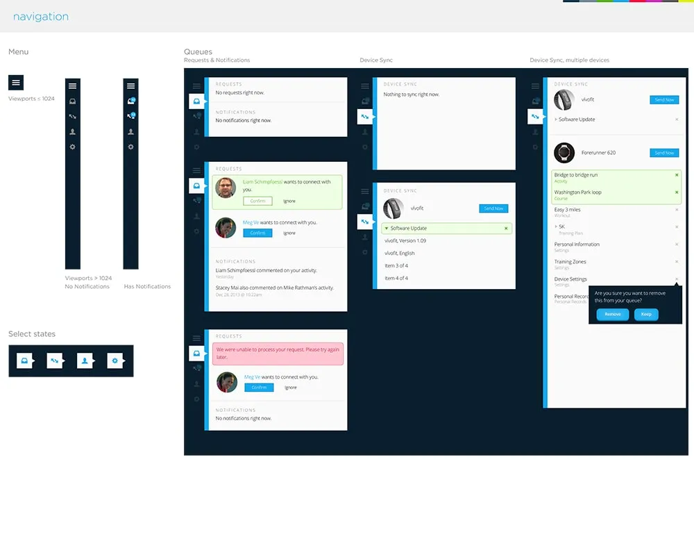
Menus
Brand Development
Before the relaunch, Connect lacked any kind of distinct visual brand. We created a clean and simple typographic identity that could both stand on its own and complement the Garmin logo when they appeared together on packaging, and in advertising.
Before
Concepts
Final Logo
Branded Elements
Marketing
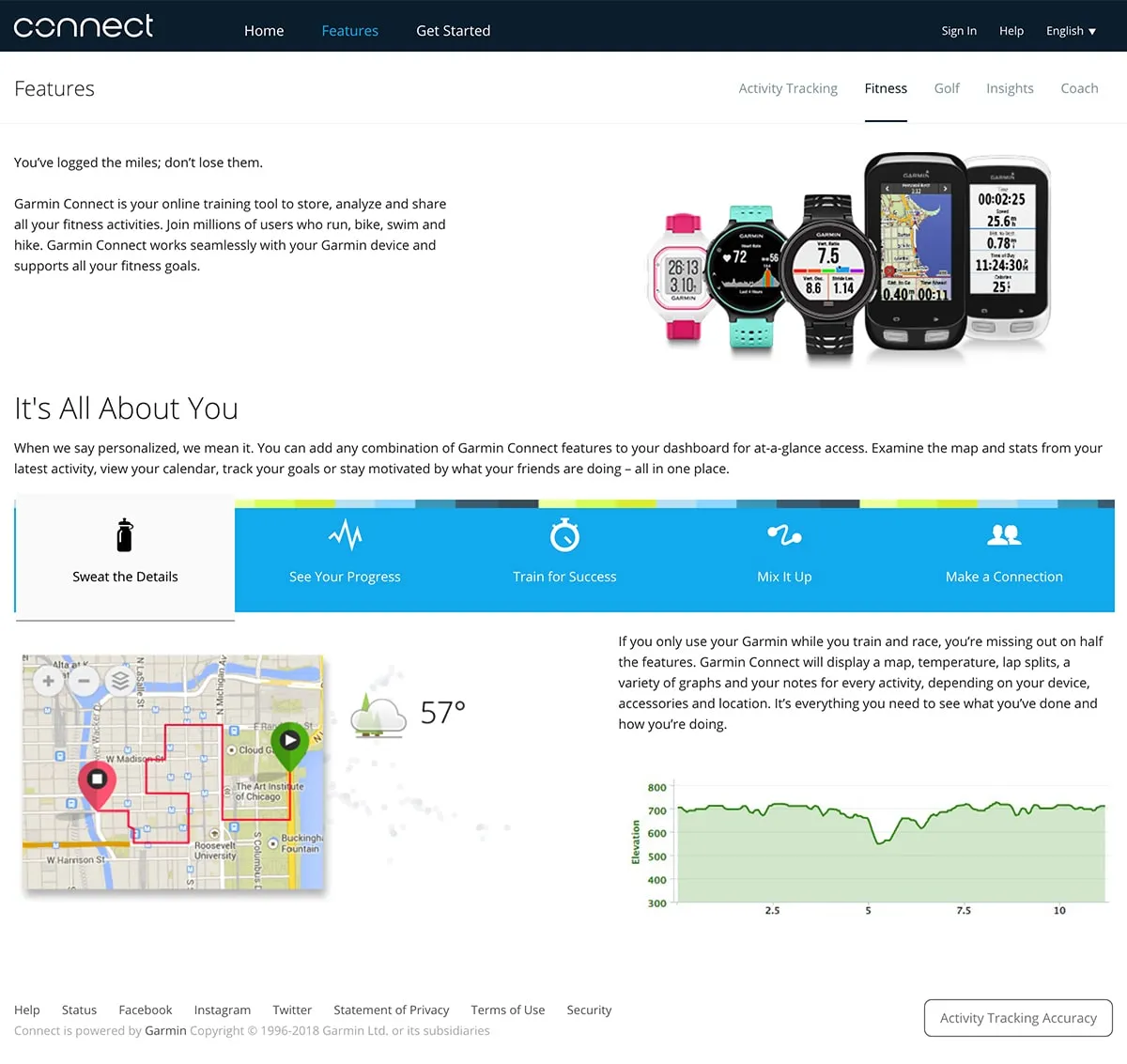
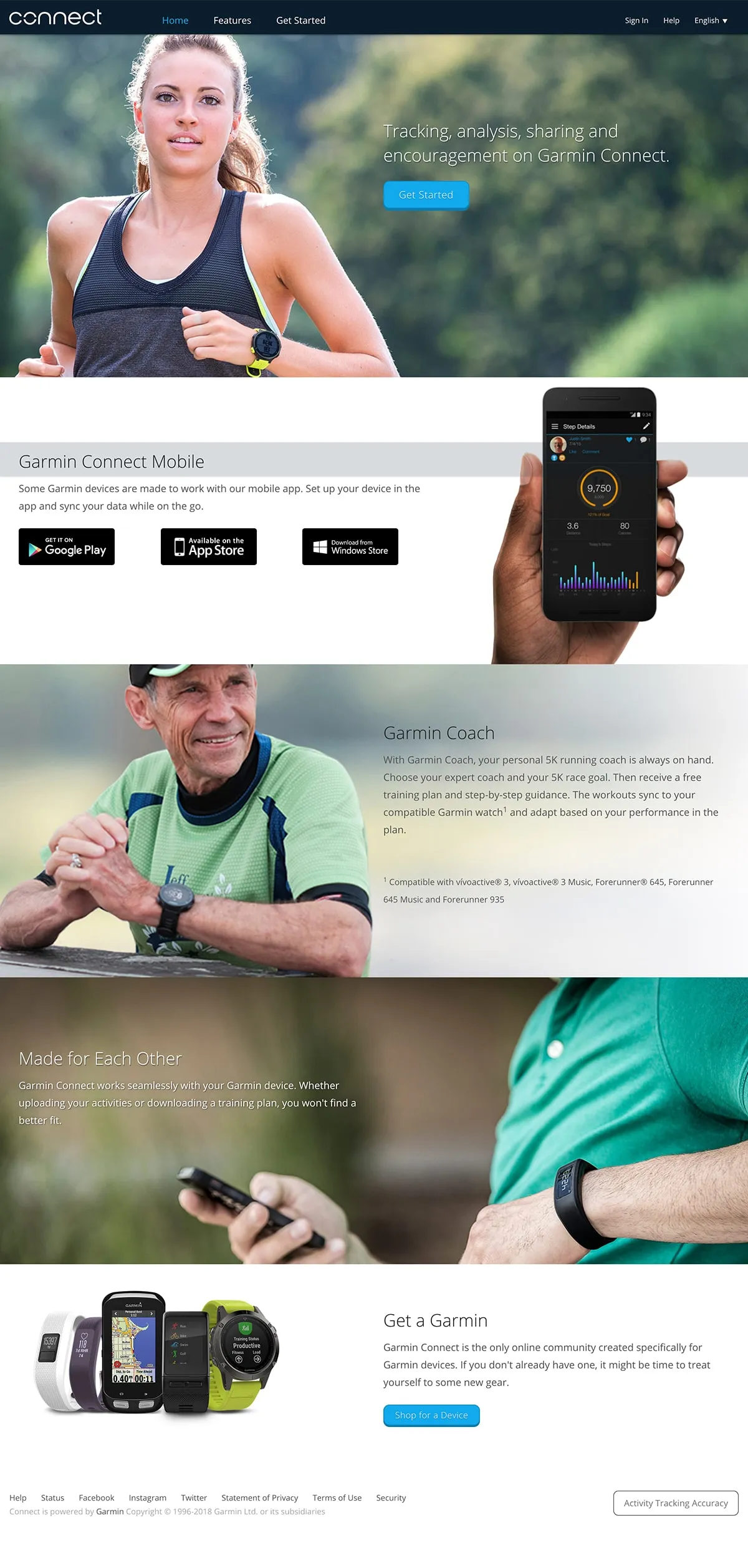
For the launch, we developed a standalone site to promote the redesigned platform and features and drive new customer registrations.
Homepage
Features